Category: Customer Experience

Career Reform – The Changing Face of Expertise

In August 2011, I took the title “consultant” off my business card after having it for eight years. It was sad to see the old friend leave, but it was for the best – for both consultant and for me.

Two years ago (22 months for those of you who are more precise), I composed two pieces on what it meant to me as I evolved out of the role of “analyst” and into the role of “consultant” (here) and how this meant developing the skills of a “selling consultant” (here). It was a heady time. I was learning a lot of new skills, meeting the challenges of a post-technical role, managing to a new level of “success”.
Many things have changed since then. But the key lesson that I learned is that the career path that was in front of me was not headed in the direction I wanted to go. The true sign of this, that I ignored at the time, but which is so obvious to me now, is when I started counting down the days to my annual vacation.

Having just finished Onward and Delivering Happiness, I read that these moments come to all people. It’s how they choose to face them that determines their happiness after.

Due to a serious of weird misfortunes, fortune shined upon me. A new opportunity was presented to me, and I was able to use it to shape a new path forward, one I think that many maturing consults imagined that their roll would look like when they started their journey.

My new role is to act as a consultant to the entire organization. And what does that mean? My goal (and I get to invent the role as I go along) is to develop and share the knowledge of the strategic use of the product line, approached from a technical and sales perspective, to help current and new members of the company not only learn the How of the product line, but the Why that motivates prospects to become company customers. I also get to see how the product plan morphs, shifts to meet new information and new ideas.

Am I happy? Yes. When I began my change from analyst to consultant, I had hoped this is where I would end up.

If I stayed the course, would I have ended up here?

Despite being a counter-factual question, I think that the answer is no. I was being squeezed, shaped, and directed by the role of consultant. I had lost control of my own career and was being driven to the next destination in a blacked-out van.
Now I have gotten out of the van, checked my bearings, and started walking in the direction I want to go in.

What’s next? Well, I’m sure that in two years, I’ll have something to share.

Customer Experience: The Vanishing Reviews

SJE is an excellent supporter of the online economy. However, she is also very focused on the experience she suffers through on many online retail applications. The question I get frequently from the other end of the living room (Retail and Wardrobe Management Control Center – see image) is: “Is Company X a customer? Because their site (is slow | is badly designed | doesn’t work | sucks)!”.
Most of the time, there isn’t much to do, and the site usually responds and SJE is able to complete the task she is focused on.

Last night, however, a retailer did something that strayed into new territory. This company unwittingly affected the customer experience to such a degree that they actually destroyed the trust of a long-term customer.

This isn’t good for me, as I wear a lot of fine products from this retailer. But even in my eyes, they committed a grievous sin.

This retailer decided, for reasons that are known only to them, to delete a number of negative comments, reviews, and ratings for a product that they have for sale.
I just checked, and sure enough, all of the comments, including my wife’s very strong negative feedback about the quality, are gone.

I can think of a number of really devious and greedy reasons why a company might do this. It could also be an accident. If it was an accident, you might want to note that reviews and comments for this product were accidentally lost.

Now, if you went to a retailer and saw that your comments and reviews had been deleted, how would you feel? Would you trust that retailer ever again? What would happen if the twittering masses picked up the meme and started to add fuel to the bonfire?

A strong business, a solid design, an amazing presentation, and unrivaled delivery aren’t enough for some businesses. As a company, there is substantial effort, time, and treasure dedicated to converting visitors into customers. And it sometimes takes only one boneheaded move to turn a customer into the anti-customer.

Customer Experience: Standing on your own four legs

Tables. They’re pretty ubiquitous. You might even be using one right now (although in the modern mobile world, you may not. LAMP POST!).

A strong business is like a table, supported by four legs.

  • The Business. The reason that resources and people have been gathered together. There is a vision of what the group wants to do and what success looks like.
  • The Design. Don’t think style; think Design/Build. This is where the group takes the business idea and determines how they will make it happen, where the stores will be, what a datacenter looks like, who they will partner with.
  • The Presentation. How the Business and the Design are shown to people. How the shelves are stocked, the landing pages look, the advertising is placed, how the business looks to potential customers.
  • The Delivery. This is the critical part of how the business uses the systems they have designed and the presentation they have crafted to deliver something of value to the potential customer.

Without any one of these, an organization will fail to meet the most critical goal it has set to be successful: an experience that turns a visitor or browser into a customer.

All the Business and MBA grads in the audience are yawning, and slapping their Venti non-fat, no-whip, decaf soy lattés down on the table. This message isn’t for you. Well, it is, but you can stand up and give your chair to one of the people behind you.

Now that I have Dev, QA, and Operations sitting with me (remember, the Business guys are still in the back of the room, tapping away on their Blackberries), tell me what you think of this conceptual table. How does the Table of Customer Experience relate to you?

Ok, put down the Red Bulls and Monsters and listen: Everything that Dev, QA, or Operations does has an effect on the experience (negative or positive) of the potential customer. If one of the table legs is broken (or even shorter than the others), the rippling shockwaves will eventually affect the entire operation.

So, if I were to ask the member so of your organization how their daily activities supported the online application in each of these four areas, do you think they could answer?

Grab a white board. This is going to be a long day.

Picture courtesy of sashafatcat

The Nomenclature Problem (or "What's in a name?")

Someone walks into your store. They say hello, poke around the racks, ask a few questions. Then they walk out.

Now, if I asked you, how would you describe that person?
Customer? Visitor? Yes?

I have been asking this question in preparation for some session for a group of motivated partners and employees in Singapore and Bangalore. As I prepare the presenter slides (not the dense textbook slides the participants get – thank you Garr Reynolds!), I keep correcting the words, typing customer to describe a visitor who is not.

When you and your teams discuss deep topics like conversion rates and transaction abandonment (WAKE UP! NO MEDITATION!) does the group classify non-buying, real people as  customers or visitors?

The label customer should be reserved for those visitors who complete the transaction and provide the revenue/information to the company whose online application they are interacting with. This means that the customer is the visitor who has bought into the entire online application experience.

A visitor becomes a customer only when they are happy with:

  • The Business
  • The Design
  • The Presentation
  • The Delivery

Where in the four areas has your application let the company down before?
If you asked a random visitor why they haven’t become a customer, what do you think the typical answer would be right now? Next week? A year from now?
Then ask your parents (or your spouse, if you’re brave) to use your application. You must show incredible restraint during this exercise (I suggest a remote operated camera and 6,000 miles of separation) to stop yourself from leaping in and telling them what to do,  shaping their experience and guiding them to your expected and desired outcome.

Can they do it? Would your parents or spouse become a customer?
When you look at your online applications tomorrow, use beginners mind to truly look at what you are doing in the four key areas. If you find yourself shaking your head and saying that this doesn’t make sense, put yourself in the visitors’ shoes.
You may ask yourself if the application you provide to support your business is truly improving the visitor experience.  What you have a strong chance of finding is that your application is designed for customers at the expense of visitors.

When a visitor doesn’t complete the tasks you defined for them to reach the goal of becoming one of your customers, what do you call them?

And do you know what to do next?

Effective Web Performance: The Wrong 80 Percent

Steve Souders is the current king of Web performance gurus. His mantra, which is sound and can be borne out by empirical evidence, is that 80% of performance issues occur between the Web server and the Web browser. He offers a fantastically detailed methodology for approaching these issues. But fixing the 80% of performance issues that occur on the front-end of a Web site doesn’t fix the 80% of the problems that occur in the company that created the Web site. Huh? Well, as Inigo Montoya would say, let me explain.

The front-end of a Web site is the final product of a process, (hopefully) shaped by a vision, developed by a company delivering a service or product. It’s the process, that 80% of Web site development that is not Web site development, that let a Web site with high response times and poor user experience get out the door in the first place.

Shouldn’t the main concern of any organization be to understand why the process for creating, managing, and measuring Web sites is such that after expending substantial effort and treasure to create a Web site, it has to be fixed because of performance issues detected only after the process is complete?

Souders’ 80% will fix the immediate problem, and the Web site will end up being measurably faster in a short period of time. The caveat to the technical fix is that unless you can step back and determine how a Web site that needed to be fixed was released in the first place, there is a strong likelihood that the old habits will appear again.

Yahoo! and Google are organizations that are fanatically focused on performance. So, in some respects, it’s understandable how someone (like Steve Souders) who comes out of a performance culture can see all issues as technical issues. I started out in a technical environment, and when I locked myself in that silo, every Web performance issue had a technical solution.

I’ve talked about culture and web performance before, but the message bears repeating. A web performance problem can be fixed with a technical solution. But patching the hole in the dike doesn’t stop you from eventually having to look at why the dike got a hole in the first place.

Solving performance Web problems starts with not tolerating them in the first place. Focusing on solving the technical 80% of Web performance leaves the other 80% of the problem, the culture and processes that originally created the performance issues, untouched.

Web Performance, Part IX: Curse of the Single Metric

While this post is aimed at Web performance, the curse of the single metric affects our everyday lives in ways that we have become oblivious to.

When you listen to a business report, the stock market indices are an aggregated metric used to represent the performance of a set group of stocks.

When you read about economic indicators, these values are the aggregated representations of complex populations of data, collected from around the country, or the world.

Sport scores are the final tally of an event, but they may not always represent how well each team performed during the match.

The problem with single metrics lies in their simplicity. When a single metric is created, it usually attempts to factor in all of the possible and relevant data to produce an aggregated value that can represent a whole population of results.
These single metrics are then portrayed as a complete representation of this complex calculation. The presentation of this single metric is usually done in such a way that their compelling simplicity is accepted as the truth, rather than as a representation of a truth.

In the area of Web performance, organizations have fallen prey to this need for the compelling single metric. The need to represent a very complex process in terms that can be quickly absorbed and understand by as large a group of people as possible.

The single metrics most commonly found in the Web performance management field are performance (end-to-end response time of the tested business process) and availability (success rate of the tested business process). These numbers are then merged and transformed by data from a number of sources (external measurements, hit counts, conversions, internal server metrics, packet loss), and this information is bubbled up in an organization. By the time senior management and decision-makers receive the Web performance results, that are likely several steps removed from the raw measurement data.

An executive will tell you that information is a blessing, but only when it speeds, rather than hinders, the decision-making process. A Web performance consultant (such as myself) will tell that basing your decisions on a single metric that has been created out of a complex population of data is madness.

So, where does the middle-ground lie between the data wonks and the senior leaders? The rest of this post is dedicated to introducing a few of the metrics that will, in a small subset of metrics, give a senior leaders better information to work from when deciding what to do next.

A great place to start this process is to examine the percentile distribution of measurement results. Percentiles are known to anyone who has children. After a visit to the pediatrician, someone will likely state that “My son/daughter is in the XXth percentile of his/her age group for height/weight/tantrums/etc”. This means that XX% of the population of children that age, as recorded by pediatricians, report values at or below the same value for this same metric.

Percentiles are great for a population of results like Web performance measurement data. Using only a small set of values, anyone can quickly see how many visitors to a site could be experiencing poor performance.

If at the median (50th percentile), the measured business process is 3.0 seconds, this means that 50% of all of the measurements looked at are being completed in 3.0 seconds or less.

If the executive then looks up to the 90th percentile and sees that it’s at 16.0 seconds, it can be quickly determined that something very bad has happened to affect the response times collected for the 40% of the population between these two points. Immediately, everyone knows that for some reason, an unacceptable number of visitors are likely experiencing degraded and unpredictable performance when they visit the site.

A suggestion for enhancing averages with percentiles is to use the 90th percentile value as a trim ceiling for the average. Then side-by-side comparisons of the untrimmed and trimmed averages can be compared. For sites with a larger number of response time outliers, the average will decrease dramatically when it is trimmed, while sites with more consistent measurement results will find their average response time is similar with and without the trimmed data.

It is also critical to examine the application’s response times and success rates throughout defined business cycles. A single response time or success rate value eliminates

  • variations by time of day
  • variations by day of week
  • variations by month
  • variations caused by advertising and marketing

An average is just an average. If at peak buiness hours, response times are 5.0 seconds slower than the average, then the average is meaningless, as business is being lost to poor performance which has been lost in the focus on the single metric.

All of these items have also fallen prey to their own curse of the single metric. All of the items discussed above aggregate the response time of the business process into a single metric. The process of purchasing items online is broken down into discrete steps, and different parts of this process likely take longer than others. And one step beyond the discrete steps are the objects and data that appear to the customer during these steps.

It is critical to isolate the performance for each step of the process to find the bottlenecks to performance. Then the components in those steps that cause the greatest response time or success rate degradation must be identified and targeted for performance improvement initiatives. If there are one or two poorly performing steps in a business process, focusing performance improvement efforts on these is critical, otherwise precious resources are being wasted in trying to fix parts of the application that are working well.

In summary, a single metric provides a sense of false confidence, the sense that the application can be counted on to deliver response times and success rates that are nearly the same as those simple, single metrics.

The average provides a middle ground, a line that says that is the approximate mid-point of the measurement population. There are measurements above and below this average, and you have to plan around the peaks and valleys, not the open plains. It is critical never to fall victim to the attractive charms that come with the curse of the single metric.

Web Performance, Part IV: Finding The Frequency

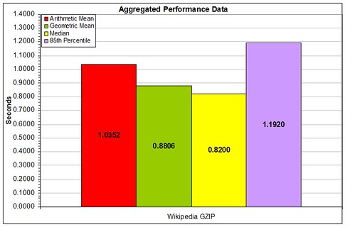
In the last article, I discussed the aggregated statistics used most frequently to describe a population of performance data.
stats-articles
The pros and cons of each of these aggregated values has been examined, but now we come to the largest single flaw: these values attempt to assign a single value to describe an entire population of numbers.

The only way to describe a population of numbers is to do one of two things: Display every single datapoint in the population against the time it occurred, producing a scatter plot; or display the population as a statistical distribution.

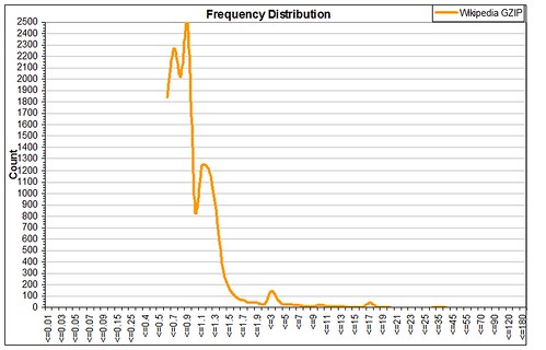
The most common type of statistical distribution used in Web performance data is the Frequency Distribution. This type of display breaks the population down into measurements of a certain value range, then graphs the results by comparing the number of results in each value container.

So, taking the same population data used in the aggregated data above, the frequency distribution looks like this.
stats-articles-frequency
This gives a deeper insight into the whole population, by displaying the whole range of measurements, including the heavy tail that occurs in many Web performance result sets. Please note that a statistical heavy tail is essentially the same as Chris Anderson’s long tail, but in statistical analysis, a heavy tail represents a non-normally distributed data set, and skews the aggregated values you try and produce from the population.

As was noted in the aggregated values, the ‘average’ performance like falls between 0.88 and 1.04 seconds. Now, when you take these values and compare them to the frequency distribution, these values make sense, as the largest concentration of measurement values falls into this range.

However, the 85th Percentile for this population is at 1.20 seconds, where there is a large secondary bulge in the frequency distribution. After that, there are measurements that trickle out into the 40-second range.

As can be seen, a single aggregated number cannot represent all of the characteristics in a population of measurements. They are good representations, but that’s all they are.

So, to wrap up this flurry of a visit through the world of statistical analysis and Web performance data, always remember the old adage: Lies, Damn Lies, and Statistics.
In the next article, I will discuss the concept of performance baselining, and how this is the basis for Web performance evolution.

Web Performance, Part II: What are you calling average?

For a decade, the holy grail of Web performance has been a low average performance time. Every company wants to have the lowest time, in some kind of chest-thumping, testosterone-pumped battle for supremacy.

Well, I am here to tell you that the numbers you have been using for the last decade have been lying. Well, lying is perhaps to strong a term. Deeply misleading is perhaps the more accurate way to describe the way that an average describes a population of results.
Now before you call your Web performance monitoring and measurement firms and tear a strip off them, let’s look at the facts. The numbers that everyone has been holding up as the gospel truth have been averages, or, more correctly, Arithmetic Means. We all learned these in elementary school: the sum of X values divided by X produces a value that approximates the average value for the entire population of X values.

Where could this go wrong in Web performance?

We wandered off course in a couple of fundamental ways. The first is based on the basic assumption of Arithmetic Mean calculations, that the population of data used is more or less Normally Distributed.

Well folks, Web performance data is not normally distributed. Some people are more stringent than I am, but my running assumption is that in a population of measurements, up to 15% are noise resulting from “stuff happens on the Internet”. This outer edge of noise, or outliers, can have a profound skewing effect on the Arithmetic Mean for that population.

“So what?”, most of you are saying. Here’s the kicker: As a result of this skew, the Arithmetic Mean usually produces a Web performance number that is higher than the real average of performance.

So why do we use it? Simple: Relational databases are really good at producing Arithmetic Means, and lousy at producing other statistical values. Short of writing your own complex function, which on most database systems equates to higher compute times, the only way to produce more accurate statistical measures is to extract the entire population of results and produce the result in external software.
If you are building an enterprise class Web performance measurement reporting interface, and you want to calculate other statistical measures, you better have deep pockets and a lot of spare computing cycles, because these multi-million row calculations will drain resources very quickly.

So, for most people, the Arithmetic Mean is the be all and end all of Web performance metrics. In the next part of this series, I will discuss how you can break free of this madness and produce values that are truer representations of average performance.

Copyright © 2024 Performance Zen

Theme by Anders NorenUp ↑